
Insurance App Redesign
In 2022, senior leadership recognized that in two years (2024), 26% of clients would be up for contract renewal, which if lost would have a significant financial impact on the company if not secured. Many of our major clients expressed concern regarding the digital experience for their employees, who cited that navigation was the main hurdle with the native application.
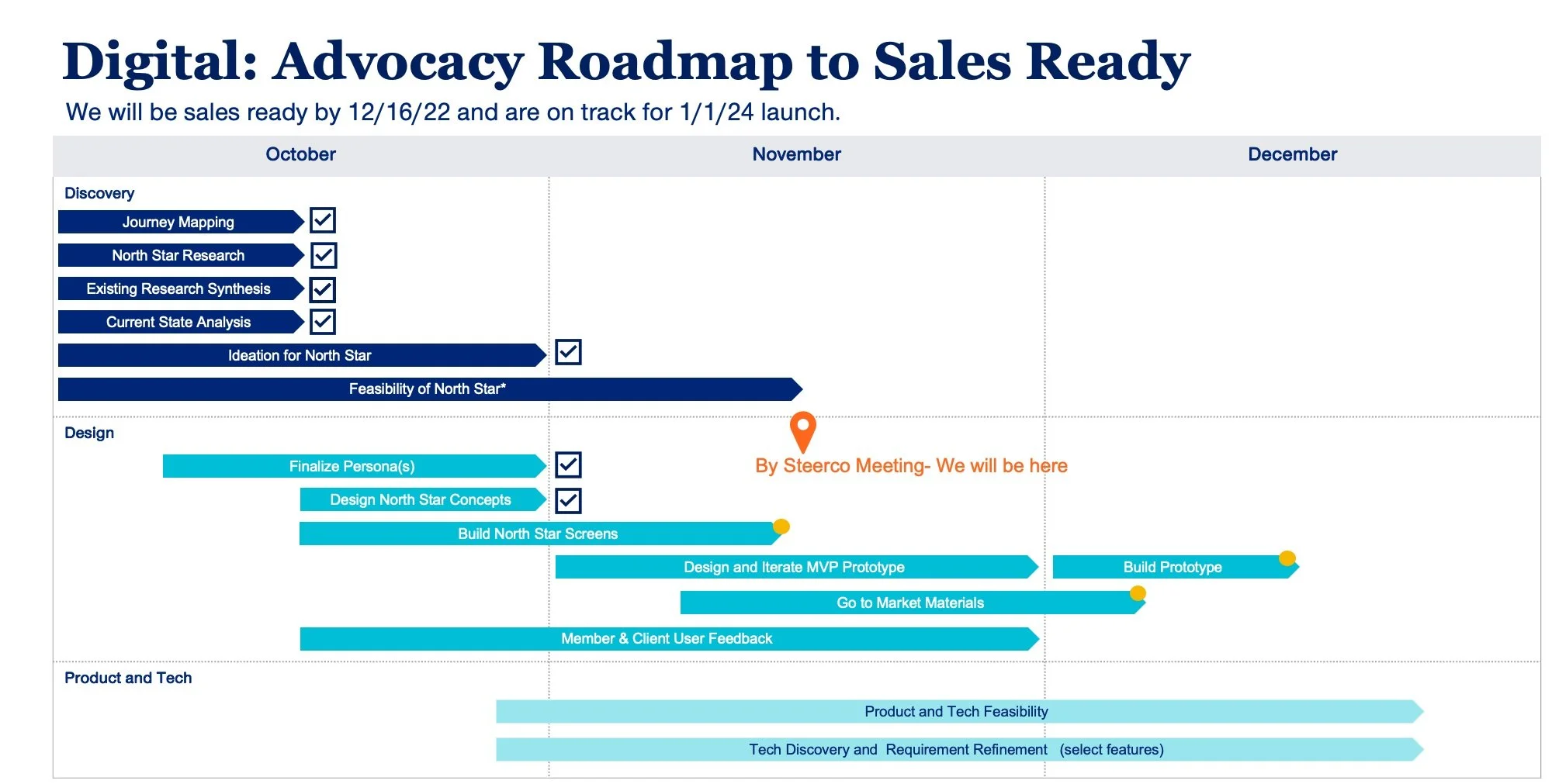
The Approach
Led two UI designers for 3-months leading up to a major sales demo to create a north star vision for the product and scale back according to what’s feasible in our two year time frame by:
Define our key personas, journeys, and storyline that brings the feature and functions needed to life.
Focus on providing digital support for the moments that matter for our member, while harnessing the full capabilities of the enterprise.
Create a robust prototype that can be leveraged during the sales demo.
The Process
I started by distilling years of member comments, marketing segmentation data, previous persona and archetypes work, generative research, as well as third-party consumer research into a set of personas, user stories, and journey maps.
During this process, we realized that most of our impact could be focused on our top marketing segment who made up 40% of our user base - the Sandwich Generation. This segment is characterized by having children still within their household while also taking care of ailing parents.
Through listening sessions and focus groups, we realized that for these members are typically the CEO of the household, making critical decisions when it comes to everyone’s health, however time is extremely limited and they’re personal health typically falls to the bottom of their priority list. We set out to create an app that worked for them.


The Personas and Journey
These exercises highlighted the need two needs that required a major redesign the application:
First, core capabilities needed to ease the burden of health care decision making for our core audience did not exist in the app.
The home screen, being the heart of an application, would would need to evolve into a dynamic launchpad for the member.
Our team split off into two working silos. One designer roughly sketched wireframes for key features, while the second designer focused on iterations of the dashboard.
After finalizing both, we then worked with product and business teams to categorize these features across an impact vs effort matrix, then crafted short-, mid-, and long-term capabilities based on feasibility and user need to outline a clear roadmap for success.


The Key Features
The concepts flow below highlights a few key features for the Sandwich Generation, such as the ability to access and manage their dependents’ health, connecting their health devices to get personalized insights and benefits recommendations, and the ability to chat with an Advocate when they need help. All of these features were first details during this project and have since become core strategies for the digital experience.

The Dashboard Development
The screens below showcase the development of the dashboard through many iterations and feedback looks with stakeholders and members.

The Outcome
These concepts were passed to the assigned journey design and engineering teams to further test, refine, and build. This resulted in security of major clients, while also satisfying many member needs. Within a year of the first major release, our application:
Became the #2 app within the Medical section of the Apple store.
Became the #1 share of all company digital traffic, growing from 39% to 56%.
Saw an NPS increase of 19 points (from 9 to 28).
Additionally, Rose and her family’s personas are used company-wide.

